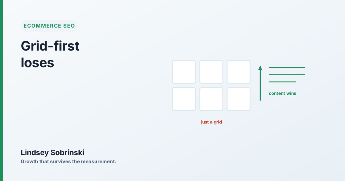
Open your biggest category page and read it the way a search engine does. Strip out the product images and the price tags and ask: what’s actually here for an engine to understand? On most ecommerce sites the answer is the product titles, and nothing else. A grid, a filter rail, a pagination control. No copy that says what this category is, who it’s for, or how to choose within it.
That’s a grid-first page, and it’s why a smaller competitor with a fraction of your brand strength can out-rank you on nearly every non-brand term in the category.
A grid gives the engine almost nothing
Search engines rank pages on how well they cover a query’s intent. A category page that’s pure grid hands over almost no signal to work with, a list of product names and some navigation. To an engine deciding which page best serves “wedding guest dresses” or “sage green bridesmaid dresses,” a grid is a weak candidate, because it doesn’t demonstrate that the page comprehensively covers the topic. It just proves you sell the thing.
On one audit, most of a large retailer’s category pages scored barely above the floor for content, grid-first, effectively no editorial copy. Meanwhile a smaller, content-led competitor was using real category-page content to claim the same keywords, and out-ranking the larger, better-known brand on the majority of its non-brand terms. Brand strength wasn’t enough. On a non-brand query, the engine rewarded the page that actually covered the intent.
Content is how you “claim” a category
The competitor’s move wasn’t complicated. It was treating category pages as content, not just inventory: a page that frames what the category is, helps the shopper choose within it, and answers the questions buyers actually ask, with the products right there to buy.
That editorial layer does two things at once. It gives the engine the coverage it needs to rank you for the head term, and it catches the shopper earlier, when they’re still deciding rather than just filtering. A grid serves only the buyer who already knows exactly what they want. A content-led page serves that buyer and the much larger group still figuring it out.
A grid proves you sell the thing. Content proves you understand it. On a competitive non-brand query, the engine ranks the page that understands the category, even when a bigger brand sells more of it.
The obvious objection, and the answer
The reflex against this is always the same: won’t adding content push the products down and hurt conversion? It will, if you do it clumsily, a wall of text above the grid is a bad shopping experience and a worse SEO tactic.
The pattern that works keeps the product grid high on the page, where the ready-to-buy shopper expects it, and places the bulk of the editorial content below the grid or in expandable sections. The buyer who’s ready to convert never has to scroll past an essay; the engine and the researching shopper still get the depth. Done this way, content-led category pages rank for more and convert as well or better, because they’re serving two audiences instead of one.
Where to start
Take your highest-value category pages, the ones with real search demand where you rank but don’t capture, and add a genuine content layer to each. A short intro that frames the category. A band of useful guidance on how to choose. A set of the real questions buyers ask, answered plainly, with FAQ schema on top so they’re liftable into answer boxes. Keep the grid prominent; put the depth below it.
You don’t need this on every page. You need it on the commercial pages where a content-led competitor is quietly beating you on intent, because those are the terms where a grid will keep losing no matter how strong your brand is. The engine isn’t ranking your brand on a non-brand query. It’s ranking the page that best covers the category, and right now that page belongs to whoever bothered to write it.